This is what Windows 8 on the desktop should have looked like
I don’t know about you guys but when I saw Metro UI for the first time on a desktop PC, the first word that came to my mind started with ‘W’ and ended with ‘TF’. Sure, Metro is a beautiful user interface but when put on a 22-inch monitor it looks terribly out of place and doesn’t feel right when operated with a mouse. It looks even worse when placed alongside the old Windows 7/Vista UI, which will also be part of Windows 8. I wished Microsoft had come up with a way to make the existing Windows 7/Vista UI look more like Metro instead of having them simultaneously in one OS.
Unfortunately, my wish was left unfulfilled by Windows 8. But there is a designer out there who took almost exactly what I had in mind and made a mockup out of it. This, according to me and that designer, is how Windows 8 should have looked like.
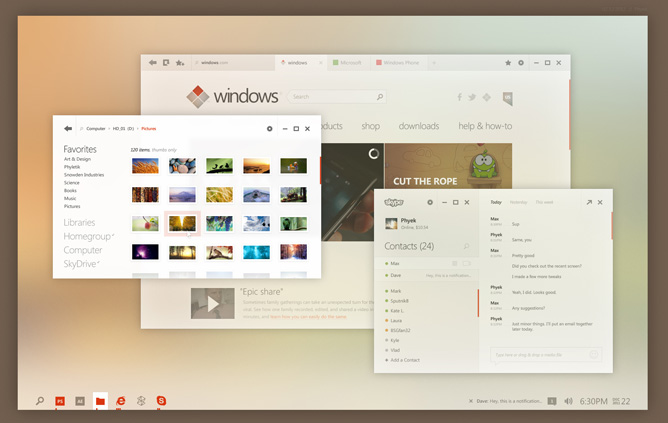
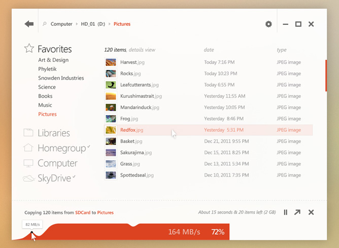
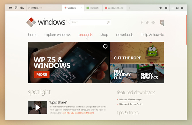
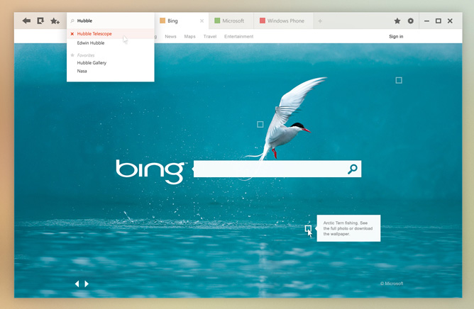
The talented designer goes by the name Sputnik8 on The Verge forums and has gone through great effort to redesign certain key elements of the Windows UI, such as the desktop, the Explorer window, the browser and the media player. He even redesigned the Windows logo, which looks a hell of a lot better than what Microsoft came up with. This concept UI is simple, beautiful and in-line with Microsoft’s Metro design language, without going too far from the original Windows look. And it looks like it could even work well on a touchscreen. In other words, it’s perfect.
Too bad that all we can do right now is look at these pictures and drool. Hopefully Microsoft sees these pictures and hires this guy to design their next version of Windows.
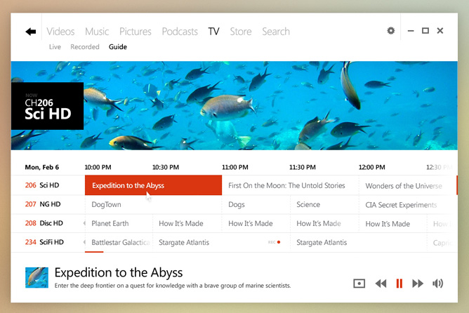
You can click on the source link below for more pictures.
Featured
 Oppo R1x battery life test
 Oppo R7 battery life test
 HTC One M9+ preview
 HTC One E9+ performance benchmarks
 Benchmarking Asus ZenFone 2 ZE551ML with Intel Atom Z3580 SoC and 4GB of RAM
Categories
- Mobile phones
- Mobile software
- Mobile computers
- Rumors
- Fun stuff
- Various
- Android
- Desktop software
- Featured
- Misc gadgets
- Gaming
- Digital cameras
- Tablets
- iOS
- Desktop computers
- Windows Phone
- GSMArena
com - Online Services
- Mobile Services
- Smart Watches
- Battery tests
- BlackBerry
- Social Networks
- Web Browsers
- Portable Players
- Network Operators
- CDMA
- Windows
- Headphones
- Hands-on
Comments
Rules for posting