Nokia Maps and Bing Maps unify their map design
The partnership between Nokia and Microsoft developed even deeper roots today. As of now, Nokia Maps and Bing Maps have a unified maps design.
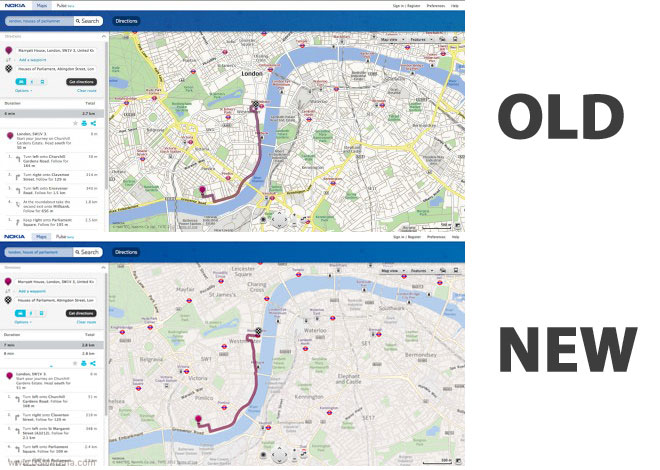
The goal is to offer users more simplified design that is easy on the eye and will help them better navigate by removing unnecessary clutter from the maps themselves.
Other various features include updated typography, which is now clearer and easier to read. Now, the font used by Bing and Nokia is Nokia’s Pure typeface.
Besides that, overall use of colors has lead to enhanced contrast, which helps identify different roads from one another like on a busy intersection.
Nokia and Bing designers say that the change is for good and seem delighted by the results of their work, but at the end of the day its us, users, who have the last word. So, how do you find the changes?
Featured
 HTC One E9+ performance benchmarks
 Oppo R7 battery life test
 Xiaomi Mi 4i battery life test
 Hot or Not: Android M, iOS 9 and Watch OS 2.0
 HTC One M9+ preview
Categories
- Mobile phones
- Mobile software
- Mobile computers
- Rumors
- Fun stuff
- Various
- Android
- Desktop software
- Featured
- Misc gadgets
- Gaming
- Digital cameras
- Tablets
- iOS
- Desktop computers
- Windows Phone
- GSMArena
com - Online Services
- Mobile Services
- Smart Watches
- Battery tests
- BlackBerry
- Social Networks
- Web Browsers
- Portable Players
- Network Operators
- CDMA
- Windows
- Headphones
- Hands-on
Comments
Rules for posting